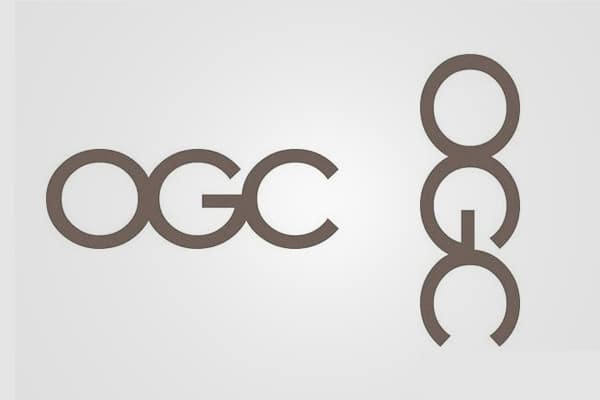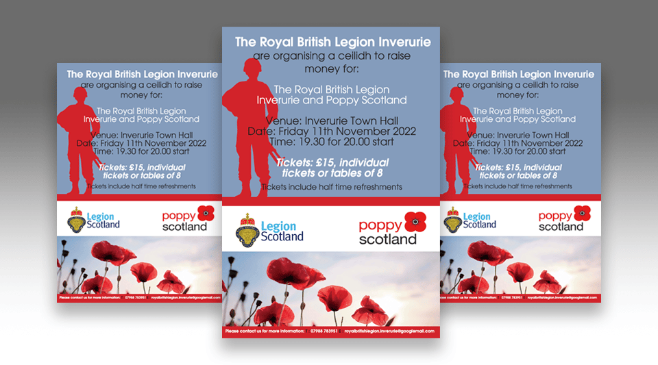


3 Branding Fails

Happy International Dog Day!! ?❤️
Next time you think about getting a puppy I would definitely recommend considering rescuing a dog. It was the best choice I have made in years, when I gave our new little friend Fudge a new life!
Obviously I was pressured by my 10 year old daughter with her puppy eyes Dad pleeeeaaassseee LOL! It’s been a tough year and she’s been alot of work, but definitely makes us laugh and gets us out the house. I would highly recommend the DAWGS charity that will help you.
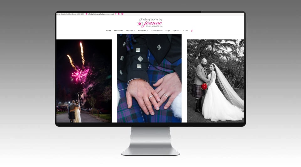
Photography by Joanne – Website

WordPress 6.0
WordPress has recently released 6.0. All versions of WordPress now power around 42% of the web. That’s approximately 810,000,000 sites.
Following the footsteps of the previous major release, WordPress 6.0 continues to make improvements to full site editing and allows users to do more with this feature. There are several upgrades coming to the design tools. Firstly, the new layout options which include arranging design in a horizontal or vertical manner.
Other features include block editing, style changes and improved text editing, among others.
Stay up to date with all the latest WordPress with us. And if you want to take your website to a new level and implement these new improvements, contact us to us today!
#wordpress #online #webdesign

The Five Core Components of User Experience
User experience is something all designers take into account — something that can be done by describing the five core components of UX:
Information Architecture (IA)
Information Architecture connects people to content in a way that is most understandable to them. It creates a hierarchy of content on a page and uses different elements to add structure. This is organised and makes it easy to find content.
Interaction Design
Interaction Design deals with the specific interactions between users and a screen. Visual Design responds to the user goals supported in Interaction Design to communicate the brand using graphics, images, fonts, color, icons, and so on.
Usability
Usability deals with leveraging data to determine the validity of design decisions. It is the role of the UX designer to communicate any points felt during the use of a product.
Prototyping
A prototype can be defined as a preliminary version from which other forms are developed. As a designer, prototyping offers a cheap and flexible way to test what looks great and is fit for purpose, whether it’s for a mobile app, physical product or a website. It also offers a way to iterate based on feedback from stakeholders and users in the context of usability studies.
Visual Design
Visual design is about using the visual aspect of a product to improve the user’s experience. While visual design is not all there is to design, it is a crucial part of a well-thought-out product. It communicates a lot about a company’s brand and can be influential in how desirable and engaging a product is.
Is Print Dead?
Is Printing Dead?
I don’t think so…its just evolving like all of us recently!
Printing has been around for over 500 years but far from being dead in a world of social media or artificial intelligence. Print is not only alive but continues to connect with us in a way that can never really be replaced.
When you get something handed something such as a business card, you can tell a lot about the person who give it to you. A quality business card or something automated and printed cheaply. You don’t have that tangible experience online. Most printers that we use in business are adapting to their surrounding and evolving with demand. Nothing is better than preparing for a presentation with a pitch that you have printed for the client. This normally results in the client being impressed by your level of attention to detail. We need to look at all mediums to survive not just online. Some companies are extremely busy while others are struggling, and if your company is struggling, we need to get that message out to a bigger audience.
Printed materials can get you noticed. We can’t just support big chains all the time or silicone valley, supporting “local” keeps us all busy.
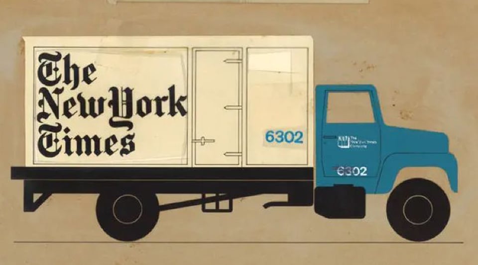
What’s your Favourite Font? :)
We love fonts and probably one of the oldest is Blackletter, also known as the Old English, Gothic, or Fraktur and was the first invented font. History tells us that The font emerged in Europe in the middle ages (around 1150 AD) and stuck around well into the 17th century. Fonts can make or break a brand if not designed correctly and properly executed for the client. The font needs to work on all mediums not just on a website? Some fonts that have been copied over the decades or subtly changed such as major brands that we own or purchase. Some major brands have survived in our ever changing crazy world…
We all love nice items but do we “trust” the brand when we purchase it or is it purely down to cost nowadays?
We believe you pay cheap you pay twice, will our brands stand the test of time?
#fontdesign #newyorktimes #brand #lovedesign #lfi2022
#brandidentity #corporateidentity #fontstyle

Do’s / Don’t of Web Design – Aberdeen
Navigating the world of web design can be difficult and outdated advice is often followed and LFI Creative are here to help.
Do: Make Use of Design Patterns
You can’t make your site like every other, so our job is to pick and choose which design patterns will be most helpful to your target demographic. Design Patterns sound like a complex technique. All it means is copying standard, well-known approaches.
Do: Make It Inclusive
Inclusive design holds the opinion that the web is for everybody.
Excluding anyone from your website is wrong. But, perhaps more importantly, excluding 5% of users deducts 5% from your profits. It’s never been easier to be inclusive. We make your website responsive and follow accessibility guidelines!
Do: Keep It Simple
99 times out of 100, the simple choice is the right choice. Most people aren’t interested in an original design. They’re interested in accomplishing a task. The less effort expended to complete the task, the better the experience.
Complexity most often creeps into navigation. Start with a logical structure, and use simple, hierarchical navigation.
Do: Stay Focussed
Every website has goals. It might be promotion, profit, utility, or a combination. Each part of that website, every single page, should have one goal.It’s OK to still have navigation, links, and secondary goals provided each page has a single clear purpose.
Do: Keep Your UI Consistent
Consistency is often referred to as the hallmark of quality. It means that you’ve paid attention to details. But consistency isn’t just about giving a good impression. Consistency is also essential for good UX (user experience).
Areas that often fail the consistency test are the corner radius of boxes, the style of links, and the tone of writing.
Don’t: Make Users Wait
The worst thing you can do is make users wait. The more technology advances, the faster connections get the higher user expectations.
Your site needs to load in under a second and be interactive in under two seconds. Otherwise, you’ll lose customers who bounce back to their search engine and try one of your competitors instead.
Delays don’t only apply to the speed of your site. You need to ensure that the information or product a customer wants is easy to access. Don’t bury it multiple levels deep in your site. If users are delayed by complicated navigation or unpredictable structure, they will exit your site as surely as if it took 10 seconds to load.
Users have zero amounts of patience.
Don’t: Leave Content Until Last
Content is frequently left until last. That’s because it’s hard. Just because we learned to read and write as kids doesn’t mean we can write persuasive, engaging sales copy.
Most websites make three big mistakes with their content.
Mistake one is unbalanced copy. That means writing 25 words about your flagship product and 5,000 words about the company’s history.
Mistake two is writing for the company, not for the customer. That means organizing content around the company structure rather than customer tasks.
Mistake three is too much content at once. Walls of text are a turn-off. Instead, write short, scannable snippets that will keep customers engaged.
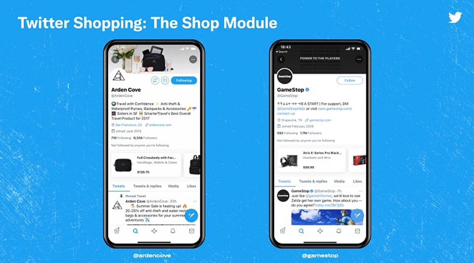
Twitter Launches New Shopify Integration to Boost eCommerce Options
Twitter has launched a new partnership with Shopify, which will enable online shops to list their products on their Twitter Profiles, with each item, when tapped, then redirecting users to the product page to make a purchase.
As explained by Twitter:
“We built a Twitter sales channel app, available in Shopify’s App Store and through the Shopify admin, which enables merchants to connect their Twitter account to their Shopify admin and onboard onto our Shopping Manager – the entrypoint to our suite of Twitter Shopping tools where merchants can access and manage our shopping features.”
Those shopping features include a carousel display of products on your profile, and/or a dedicated product display page, with Shopify-connected listings for such now being updated in real time, reflecting your Shopify inventory.
“When they’re ready to purchase, shoppers can checkout on the merchant’s website. Starting today, we are also expanding beyond the beta testing phase for Shop Spotlight and Twitter Shops and making both features available to all merchants in the US”
Twitter initially announced its Shop Spotlight (originally called the ‘Shop Module) last July, adding onto its Professional Profile tools.
“When people visit a profile with the Shop Spotlight enabled, they can scroll through the carousel of products and tap through on a single product to learn more and purchase seamlessly in an in-app browser, without having to leave Twitter.”
Twitter’s Professional Profiles were initially only available to selected merchants, but now, all users can convert their Twitter profile to its business option, which provides additional display features for brands, including business category, opening hours, location info, etc.
And now, for Shopify merchants, you can list products too, facilitating direct connection to your purchase pages.
But they are coming, and in conjunction, these new eCommerce tools could be a great way to better connect your product listings into real time tweet discussion.


