Branding is a complicated process. Many companies spend hundreds of thousands (if not millions) of pounds creating the perfect brandbut often, all they receive is a negative backlash and do not think the process through.
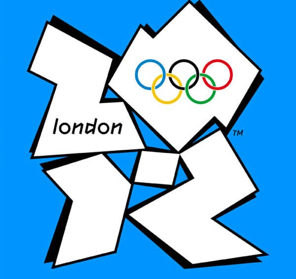
Take the 2012 London Olympics logo for example as above.
It might have cost £400,000 and took a year to design, but it received its fair share controversy, and looked like a “kids competition entry”
For many, it goes down as one of the worst logos ever, but we think we’ve found some that are even worse.
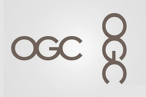
There’s actually nothing wrong with the logo for the Office of Government Commerce. That is, until you rotate it ninety degrees clockwise.
You can see the original (properly oriented) logo on the left, with the rotated version on the right.
If you can’t see what we’re referring to, keep looking. You’ll see it eventually….
Utilising imagery to replace certain letters is a common theme in many logo designs. The thing is, if you get it wrong, you end up with something like this.
Again, you might not see it straight away so we’ll give you a clue. It has something to do with the image of the computer mouse replacing the letter “U”.
Have you come across any ridiculously terrible logo fails?
If so, give us an email and if we think it deserves a place, we’ll make sure to add it.
